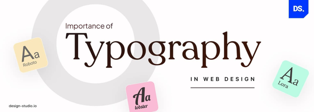
A Basic Look at Typography in Web Design: Foundation for User-Friendly Websites
Typography might seem like a simple element of web design, but it holds immense power in shaping user experience and brand perception. Effective typography makes your website visually appealing, improves readability, and guides users through your content.
This guide offers a foundational understanding of typography in web design, equipping you with the essential knowledge to make informed decisions for your website.
The Art and Science of Web Design Typography: A Comprehensive Guide
Web design typography is much more than just choosing fonts. It’s the art and science of using type to create a visually appealing and user-friendly experience for visitors to your website. Effective web design typography enhances readability, establishes brand identity, and ultimately influences user behavior.
In this comprehensive guide, we’ll delve into the fundamentals of web design typography, explore best practices, and showcase inspiring examples to elevate your website’s design.
The Evolution of Web Design Typography
We’ve come a long way since the early days of the internet, when web design typography options were limited. Today, designers have access to a vast array of fonts, allowing for greater creative expression and improved user experience.
However, the core principles of good typography remain constant: clarity, hierarchy, and consistency.
Understanding Typography Basics
Typography refers to the art and technique of arranging type to make written language visually appealing and readable. It encompasses various elements that influence the overall look and feel of text on a web page, including:
- Font family: the overall design style of the letters, categorized as serif (with small decorative strokes) or sans-serif (without).
- Font size: The size of the text, measured in pixels (px), points (pt), or em units.
- Font weight: the thickness of the font, ranging from light to bold.
- Color: The color of the text, impacts contrast and readability.
- Line height: Ththepace between lines of text, affecting legibility.
- Letter spacing is the space between individual characters.
- Alignment: How the text is positioned horizontally (left, center, right, justified).
Web Design Typography vs. Print Typography
While typography principles hold true across mediums, there are key considerations specific to web design:
- Screen resolution: Text on a web page is viewed on various screen sizes and resolutions, requiring careful font selection and responsive design.
- Readability: Since users often scan web content, clear and concise fonts are crucial for optimal reading experience.
- Font availability: Web fonts may not be universally available, so using web-safe fonts or font embedding techniques is essential.
Choosing the Right Fonts for Your Website
Selecting the perfect fonts for your website is a crucial step in crafting a strong visual identity. Here are some key factors to consider:
- Brand identity: Align your font choices with your brand personality. For example, a playful brand might opt for a quirky script font, while a professional brand might choose a classic serif font.
- Target audience: Consider the demographics and preferences of your target audience. Older audiences might prefer larger fonts with higher contrast, while younger audiences might be more receptive to trendy fonts.
- Readability: Prioritize fonts that are easy to read on various screen sizes and devices. Sans-serif fonts are generally more readable for body text on websites.
- Serif vs. Sans-serif: Serif fonts can enhance readability for headings and short blocks of text, while sans-serif fonts work well for body copy.
- Font contrast: Ensure sufficient contrast between text color and background color for optimal legibility. Black text on a white background is the safest bet, but explore color combinations within your brand palette while maintaining good contrast.
Web Design Typography: Best Practices
Now that you understand the fundamentals, let’s explore practical tips for implementing effective web design typography:
- Establish a Font Hierarchy: Create a hierarchy by using different font sizes, weights, and styles for headings, subheadings, body text, and navigation elements. This guides users through the content and emphasizes important information.
- Maintain Font Consistency: Apply a consistent set of fonts across your website for a unified look and feel. This builds brand recognition and strengthens user experience.
- Optimize Font Size: Choose font sizes that are large enough for comfortable reading across devices, typically between 16px and 18px for body text.
- Line Length Matters: Maintain an optimal line length for body text, generally between 40 and 80 characters per line. This prevents users from straining their eyes to follow long lines or having to break focus for short ones.
- Embrace White Space: Don’t overcrowd your design. Utilize white space strategically to separate elements, improve readability, and create a visually appealing layout.
- Test on Different Devices: Always test your website’s typography on various devices and screen sizes to ensure optimal rendering and user experience.
Mastering Fonts in CSS (Continued)
Cascading Style Sheets (CSS) is the backbone of styling web pages, and it plays a crucial role in controlling web design typography. Here’s a deeper dive into CSS properties for fine-tuning your typography:
- Font Family: The
font-family
property specifies the font or a list of fonts, in preferred order, that the browser should use to display the text. Example:
CSS
body { font-family: Arial, sans-serif;
}
Use code with caution.content_copy
- Font Size: The
font-size
property defines the size of the text in pixels (px), points (pt), or em units. Example:
CSS
p { font-size: 16px;
}
Use code with caution.content_copy
- Font Weight: The
font-weight
property controls the thickness of the font, ranging from lighter weights (100) to bolder weights (900). Example:
CSS
h1 { font-weight: bold;
}
Use code with caution.content_copy
- Line Height: The
line-height
property sets the spacing between lines of text, affecting readability. Example:
CSS
p { line-height: 1.5; /* 1.5 times the font size */
}
Use code with caution.content_copy
- Letter Spacing: The
letter-spacing
property adjusts the space between individual characters. Use it sparingly to avoid excessive spacing or text crowding. Example:
CSS
h2 { letter-spacing: 1px;
}
Use code with caution.content_copy
- Text Color: The
color
property defines the color of the text. Ensure sufficient contrast with the background color for optimal readability. Example:
CSS
a { color: #333; /* Dark gray */
}
Use code with caution.content_copy
- Text Alignment: The
text-align
property controls how text is positioned horizontally within its container (left, center, right, justified). Example:
CSS
.center-text { text-align: center;
}
Use code with caution.content_copy
Beyond the Basics: Advanced Web Design Typography Techniques
While mastering the fundamentals is essential, here are some advanced techniques to elevate your web design typography:
- Font Embedding: Web fonts that aren’t widely available by default can be embedded using techniques like
@font-face
in CSS. This ensures that your chosen fonts are displayed consistently across different browsers and devices. - Web Font Services: Services like Google Fonts and Adobe Fonts offer vast libraries of high-quality web fonts that you can embed on your website. These fonts are optimized for web use and often come with various weights and styles for added flexibility.
- Custom Lettering and SVG Fonts: For a truly unique brand experience, consider creating custom lettering or using Scalable Vector Graphics (SVG) fonts. These techniques offer complete control over the visual style of your typography but require advanced design skills.
- Micro-typography: Micro-typography focuses on the subtle details of typography, like kerning (adjusting space between specific letter combinations) and optical adjustments (fine-tuning the appearance of certain characters for better readability). While these refinements might seem minor, they contribute to a polished and professional typographic experience.
- Interactive Typography: Explore interactive typography techniques like hover effects, text animations, or dynamic font changes to add visual interest and user engagement. However, use these techniques sparingly to avoid overwhelming users or distracting from the content.
Inspiring Examples of Web Design Typography
By studying websites that excel in web design typography, you can gain valuable inspiration and insights. Here are a few examples to spark your creativity:
- Apple: Apple’s website is renowned for its clean and minimalist design, featuring clear and user-friendly typography. The consistent use of the San Francisco font family across platforms reinforces brand recognition. https://www.apple.com/
- Mailchimp: Mailchimp’s website utilizes a playful and quirky typographic style that aligns perfectly with its brand personality. The use of bold fonts, contrasting colors, and varying sizes creates a visually engaging experience. https://mailchimp.com/
- AIGA: The American Institute of Graphic Arts (AIGA) website showcases a sophisticated typographic approach. The use of classic serif fonts with strategic white space creates a sense of professionalism and elegance. https://www.aiga.org/
Conclusion
Web design typography plays a critical role in the success of your website. By understanding the fundamentals, implementing best practices, and exploring advanced techniques, you can craft a visually appealing and user-friendly experience that supports your brand identity and enhances user engagement. Remember, effective web design typography is not just about aesthetics; it’s about creating a clear, functional, and enjoyable user experience on your website.
Call to Action:
Ready to take your web design typography