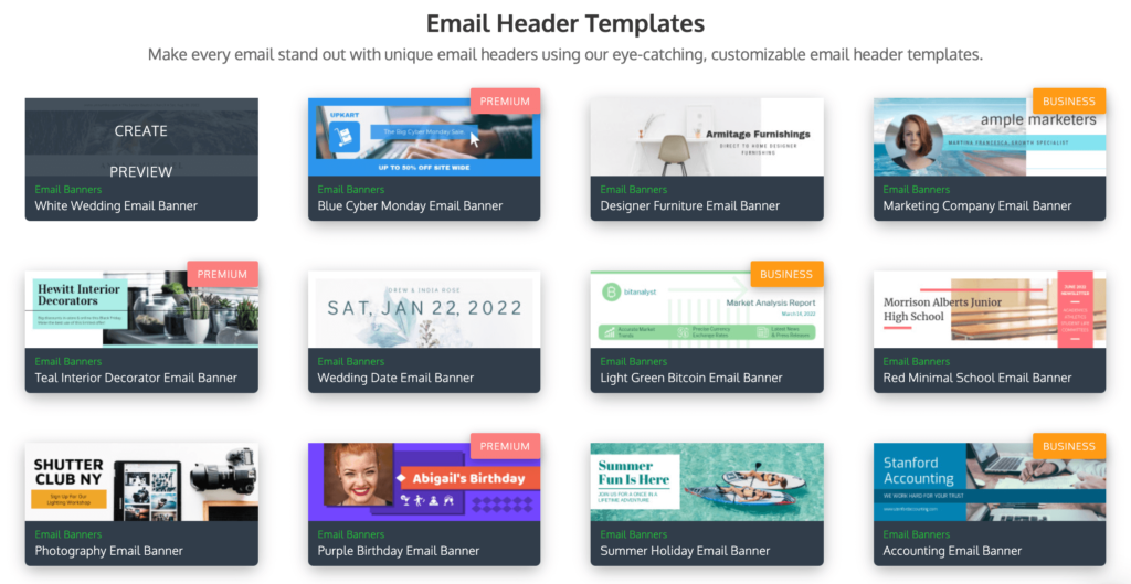
Harness the Power of 10 Email Banner Examples to Captivate Your Audience Crafting captivating email banners is an art form. They’re the silent salespeople at the top of your emails, instantly grabbing attention and influencing user actions. But where do you begin? Fear not, for we’ve compiled a treasure trove of 10 inspiring email banner examples to ignite your creativity and propel your email marketing campaigns to new heights.
1. Simplicity Reigns Supreme: Designmodo
Sometimes, less is truly more. Designmodo exemplifies this perfectly with their email banner. It features a clean blue background adorned with crisp white text, prioritizing clarity and avoiding visual clutter. This approach is ideal when you want the message to take center stage and minimize distractions. Additionally, they’ve included a clear call to action (CTA) button, seamlessly guiding users towards the desired action.
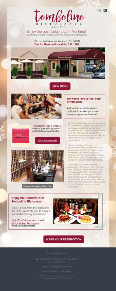
“Discover 10 stunning email banner examples that will inspire your next campaign and significantly boost your conversions. Elevate your email marketing strategy with these creative and effective designs.”
2. Photos Speak Louder Than Words: Elysium
Elysium takes a slightly more complex approach, showcasing the power of imagery. They utilize a simple background with text and a CTA button, but their secret weapon is the inclusion of captivating photos. These photos strategically highlight their product, instantly piquing user interest. Notice how the banner utilizes enticing language like “Save Now” within the CTA, further amplifying its effectiveness.
3. Know Your Audience: Shutterstock
Shutterstock understands their audience and tailors their email banner accordingly. The focal point is a stunningly detailed image of an eye – a direct reflection of their stock photography business. This not only grabs attention but also serves as a potent product demonstration. Additionally, they’ve incorporated website elements like a shopping cart icon and a “Log in” button, mirroring the familiar layout of their website.
4. Bold & Iconic: Polaroid
Polaroid’s email banner is a masterclass in brand recognition. It leverages their iconic rainbow color palette and showcases a high-quality image of a classic Polaroid camera. The headline, “The Original is Back,” is bold and attention-grabbing, making a powerful statement without excessive elements. This demonstrates the effectiveness of a vibrant approach, but remember, it should align seamlessly with your brand identity.
5. Savings Take Center Stage: NFL Sunday Ticket
This email from NFL Sunday Ticket and YouTube TV prioritizes savings upfront. Their banner features the NFL logo superimposed on a football stadium image, alongside a prominent display of savings available for new subscribers. This strategy ensures that users are instantly aware of the promotional offer, even if they don’t delve into the rest of the email. Remember, email banners should convey key information at a glance.
6. Website Integration: Paperless Post
Paperless Post’s email banner seamlessly integrates website design elements. It features a navigation bar at the top, allowing users to navigate to different sections of their website with a single click. This fosters user engagement and drives traffic to their website, which is a key objective for many email marketing campaigns.
7. Bringing the Website to You: Lego
Lego takes website integration a step further. Their email banner so closely resembles their website that it could easily be mistaken for a screenshot. This is a clever tactic! Often, the challenge lies in getting users to visit your website. Emails with banners like this essentially bring the website directly to the user. Notice how the lower section of the banner also incentivizes immediate purchase.
8. Unmissable Offers: Aldo
Similar to Lego, Aldo’s email banner mirrors a website homepage. It features a navigation bar and prominently displays a massive “50%” discount, impossible to miss. This tactic can be highly effective – highlighting a specific word, number, or phrase in large text to capture immediate attention. However, ensure the highlighted element is an exceptionally appealing offer.
9. Branding at Its Finest: Pendleton Whisky
Pendleton’s email banner exemplifies effective brand promotion. It features a clear image of their product alongside a cowboy on a horse and the text “We are true western tradition.” This instantly establishes their brand identity as rugged, all-American, and distinctly western. Your email banners should similarly convey your brand’s essence and core values.
10. Building Relationships: Nintendo
Nintendo’s email banner showcases the power of building relationships. This birthday email features a simple “Happy Birthday” message with iconic Nintendo characters. While seemingly uncomplicated, it fosters a deeper connection with the recipient, portraying Nintendo as a company that genuinely cares about its users. This emotional connection can significantly enhance user engagement.
Beyond Inspiration: Putting these Email Banner Best Practices into Action
Now that you’re armed with these 10 inspiring email banner examples, it’s time to translate inspiration into action! Here are some key takeaways to remember:
- Simplicity is powerful. Don’t overwhelm users with excessive elements.
- Visuals are king. Images and photos can dramatically enhance engagement and retention. Compelling visuals act as powerful attention magnets, drawing users in and encouraging them to delve deeper into your email content. Studies by [link to a study on the impact of visuals in marketing by NN/Group] show that people remember information significantly better when presented with visuals.
Furthermore, images and photos can:
- Convey complex ideas quickly and easily. A well-chosen image can instantly communicate a message that might take paragraphs of text to explain.
- Evoke emotions and create a lasting impression. Powerful visuals can tap into user emotions, fostering a deeper connection with your brand and message.
- Increase brand recognition. By incorporating your brand colors, logos, and unique visual style into your email banners, you can strengthen brand recognition with every email sent.
By leveraging the power of visuals in your email banner design, you can significantly boost the effectiveness of your email marketing campaigns. Remember, these first few moments of opening an email are crucial for capturing user attention. Make your email banners visually captivating, and watch your engagement rates soar!


