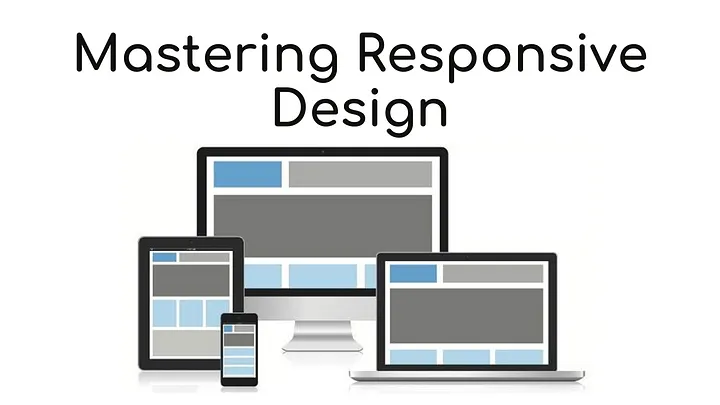
Once upon a time (circa 2010), “responsive design” was a revelation — a clever fix that made websites look okay on phones. Fast-forward to 2025, and we’ve entered an entirely new era. Today, responsive design isn’t just about resizing layouts. It’s about creating fluid, intelligent, and human-centered experiences that adapt to every device — and every user.
Because here’s the truth: people no longer just view websites — they interact with them. Across screens, voices, apps, and now even AI assistants, your digital presence has to feel natural, fast, and personal everywhere.
A Quick Throwback: How We Got Here
Once upon a (pixelated) time, designers were creating separate sites for mobile and desktop. Then, in 2010, Ethan Marcotte coined Responsive Web Design, changing everything. Fluid grids, flexible images, and media queries became the holy trinity of the modern web.
That approach worked beautifully — for a while. But as technology evolved, so did user expectations. We moved from “Does it fit on my phone?” to “Does it understand me?”
Responsive Design 2.0: Beyond the Breakpoints
In today’s landscape, a responsive site isn’t just a flexible layout — it’s a living, adaptive environment.
Here’s what responsive design means now:
- Context-Aware Design
Websites adapt not just to screen size, but to context — light/dark mode, location, language, accessibility preferences, even emotional tone. - AI-Powered Adaptation
Machine learning enables designs that personalize content, layout, and UX based on user behavior. Your site might surface different sections to a returning customer than it does to a first-time visitor. - Performance Responsiveness
Today’s users expect speed that feels instant. Frameworks like Next.js, Astro, and SvelteKit optimize for lightweight rendering and edge delivery — because 3 seconds of lag equals 0 conversions. - Accessibility as Core Strategy
True responsiveness means inclusivity — designing for screen readers, reduced motion preferences, and color contrast compliance isn’t optional; it’s essential to brand credibility and compliance (hello, global privacy and accessibility laws). - Design Systems & Component Thinking
Scalable UI systems and reusable components keep experiences consistent across devices — and teams. Tools like Figma’s AI-driven prototyping make iteration faster, smarter, and more data-informed.
Best Practices for Responsive Design in 2025
- Start With Mobile Behavior, Not Just Mobile Layouts
“Mobile-first” is evolving into “behavior-first.” Think how your users move, scroll, speak, and decide on small screens — that’s your blueprint. - Leverage AI for Personalization and Testing
AI-driven A/B testing tools can automatically tweak layouts, colors, and CTAs to fit user intent — in real time. - Design for Emotion and Empathy
Responsive design isn’t just mechanical — it’s emotional. Use motion, whitespace, and micro-interactions to create a sense of flow and comfort. - Optimize Content for Every Channel
A single headline won’t hit the same on desktop, voice, and wearable displays. Content design now means modular, adaptable storytelling. - Prioritize Privacy and Transparency
As design becomes more data-aware, users expect control. Build trust through transparent consent design and privacy-friendly personalization.
The NiCREST Perspective: Responsiveness Is About Relationships
At NiCREST, we see responsive design as more than code — it’s communication. A responsive website listens before it speaks. It anticipates needs, delivers value fast, and looks incredible doing it.
Whether we’re redesigning a small business website or optimizing a corporate digital platform, our approach blends:
- UX research that uncovers what users truly want
- AI-driven design systems that scale beautifully
- Emotion-led content strategy that turns visitors into loyal audiences
Responsive design isn’t just technical — it’s emotional intelligence expressed in pixels.
Ready to Redefine Your Digital Experience?
If your website still thinks “responsive” means “mobile-friendly,” it’s time for an upgrade.
Reach out to me and the NiCREST team for a complimentary consultation — and let’s craft a digital experience that responds to your audience, your goals, and the web of tomorrow.


